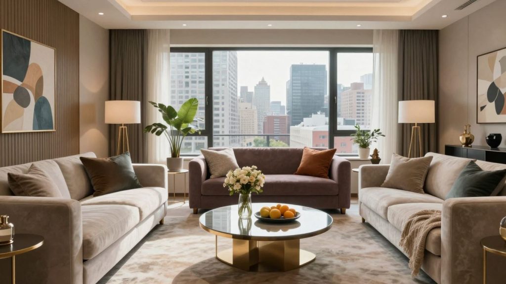
Your living room is the heart of your home — the place where you relax after a long day, entertain guests, and create memories with your loved ones. The color palette you choose plays a huge role in setting the mood, reflecting your personality, and making your space feel truly inviting. But with so many colors and combinations to choose from, selecting the right palette can feel overwhelming.
Don’t worry — this guide will help you choose the perfect colors for your living room in a simple, human-friendly way. From understanding color psychology to balancing tones and textures, you’ll discover how to make your living room both stylish and comfortable.
1. Start with the Mood You Want to Create
Before picking any paint or furniture, ask yourself what kind of atmosphere you want your living room to have. Do you want it to feel calm and relaxing? Warm and cozy? Bright and energetic?
Each color influences mood differently:
- Blue and green: Create a calming, peaceful vibe — great for relaxation.
- Beige, taupe, or white: Offer a timeless and clean aesthetic.
- Warm tones like red, orange, and yellow: Add energy and coziness.
- Gray and charcoal: Bring modern sophistication and balance.
- Pastels: Make the space feel soft, airy, and welcoming.
If you want your living room to be a retreat after busy days, consider cool colors like soft blues or greens. For a space where you socialize or host guests often, go for warmer tones like terracotta or mustard.
2. Consider the Size and Lighting of Your Space
Lighting is a key factor in how colors look in your home. Natural light, artificial light, and even shadows can change how a color appears.
- Small rooms: Lighter colors like cream, light gray, or pale pastels can make a room feel more spacious.
- Large rooms: Darker shades like navy, forest green, or deep brown add depth and coziness.
- Natural light: South-facing rooms with plenty of sunlight can handle bolder colors.
- Low-light rooms: Stick to warmer tones or light neutrals to make the space feel brighter.
Tip: Always test paint samples on your wall before committing. Look at them at different times of the day to see how lighting affects the color.
3. Build Around a Focal Point
A good way to start choosing your color palette is to find a focal point in your living room — something that draws attention, like a sofa, rug, artwork, or fireplace.
For example:
- If you have a bold blue sofa, you can design your palette around it by adding neutral walls and soft accent colors.
- If your rug has a mix of colors, pick one or two from the pattern to use for your walls or decor.
This approach makes your room feel cohesive rather than random. It also saves time when choosing complementary colors.
4. Use the 60-30-10 Rule
A classic interior design principle, the 60-30-10 rule helps balance colors in any room:
- 60%: The dominant color (walls, large furniture, or flooring)
- 30%: The secondary color (curtains, smaller furniture, or accent walls)
- 10%: The accent color (decor pieces, pillows, or artwork)
For instance, if your dominant color is beige, your secondary color could be olive green, and your accent color could be gold or rust orange. This formula keeps your room visually balanced and stylish.
5. Play with Undertones
Sometimes two shades of the same color can clash because of their undertones. Undertones are subtle hints of color beneath the surface — like a gray with a blue undertone versus one with a brown undertone.
When mixing colors, stick to either cool undertones (blue, green, violet) or warm undertones (yellow, red, orange). Mixing warm and cool tones can make the room feel disjointed unless done intentionally.
To identify undertones, hold your color samples next to true white — you’ll notice whether it leans warm or cool.
6. Add Depth with Textures and Materials
Color doesn’t only come from paint. Textures and materials also play a huge role in the overall palette.
Mixing different textures — such as wood, linen, metal, and glass — adds richness to your color scheme. For example:
- Combine a neutral palette with wood accents and green plants for a natural, organic feel.
- Use metallic accents like gold or brass to warm up a gray or navy room.
- Add soft fabrics like velvet or wool to make cool tones feel cozy.
Even if you prefer a neutral color palette, layering textures can keep the space from feeling flat or boring.
7. Look for Inspiration — but Make It Your Own
It’s easy to get lost in Pinterest boards or Instagram posts when looking for color ideas. While inspiration is great, remember that your living room should reflect you, not just a trend.
Think about:
- The colors you naturally love — your wardrobe is a good clue.
- How your home connects to other rooms (for a smooth color flow).
- The lifestyle you live — bright, playful colors might suit a family home, while muted tones may fit a calm, minimal space.
Try to balance timeless choices with personal touches. It’s better to have a space that feels like home rather than one that just looks “picture-perfect.”
8. Don’t Forget About Neutral Balance
Even if you love bold colors, adding neutrals like white, gray, or beige helps balance the look. Neutrals act as a resting point for the eyes and make bright accents stand out more.
For example:
- Pair emerald green walls with white trim and a beige rug.
- Add navy furniture with soft gray walls and wooden accents.
Using neutrals strategically can prevent your color palette from feeling overwhelming.
9. Experiment Before Finalizing
Before painting your entire room or buying new furniture, experiment!
- Paint large swatches on different walls and observe them at different times of the day.
- Use digital room visualizers or mobile apps to test color combinations.
- Try small accessories (like cushions or curtains) in your chosen shades first.
Experimenting helps you avoid expensive mistakes and ensures you’ll love your final palette.
10. Trust Your Gut
At the end of the day, the best color palette is one that makes you feel good. Trends come and go, but your personal comfort and happiness matter the most. If a color brings you joy, find a way to include it — even if it’s just through artwork, pillows, or decor accents.
Your living room should be a reflection of your personality, not just a space that looks like a magazine cover.
Conclusion
Choosing the right color palette for your living room doesn’t have to be stressful. By thinking about mood, lighting, textures, and balance, you can create a space that feels beautiful and uniquely yours. Whether you love cozy neutrals, vibrant pops of color, or modern minimalism, remember that your home should tell your story — one shade at a time.
Frequently Asked Questions (FAQs)
1. What is the best color for a small living room?
Light colors such as white, beige, pale gray, or soft pastels make small living rooms appear larger and brighter. You can still add depth with darker accents in furniture or decor.
2. How do I make my living room look cozy with colors?
Warm tones like caramel, terracotta, mustard, and earthy greens create a cozy and inviting atmosphere. Add warm lighting and textured fabrics like wool or velvet for extra comfort.
3. Can I mix warm and cool colors in my living room?
Yes, but do it carefully. Use one temperature (warm or cool) as your base and add the other as an accent. For example, pair warm beige walls with cool blue cushions for balance.
4. Should all rooms in my house have the same color palette?
Not necessarily, but using complementary shades helps maintain flow. You can vary the tones while keeping a consistent undertone throughout your home.
5. What if I change my mind after painting?
If the wall color feels off, you can tone it down with neutral decor, wall art, or lighting. Or, repaint just one accent wall instead of the entire room — it’s a simple fix that can change the look dramatically.